Posters and Adobe Illustrator. Yup those were the 2 things we did for design class this week. For posters it was similar to what we did the week before, we got into pairs, and had to re-design posters the teacher showed to us. It was pretty challenging, as certain posters were by renowned companies such as Levis and of high standard, thus having little flaws to improve on.
Okay next we started to learn how to draw with Adobe Illustrator, which is much harder than you think. It is totally different from using Photoshop, where your cursor draws a line wherever it goes. In Illustrator, drawing straight lines are pretty easy. Just click on a point, click on another point and a straight line is formed between the 2 lines. Now the hard part: drawing curves. To do that instead of simply clicking the second line, you hold your mouse down and pull the point, and a curve forms. The angle and shape of the resulting curve depends on how you pull the second point, which gets pretty easy after much practice. Oh one tip is to hold the 'shift' key down while forming your curve, which helps form shapes that are more proportionate.
Our homework was to use the pen tool to draw the outline of images which I will be doing in awhile, and besides that I didn't do much sketching the past week as it was all about Illustrator. Projects are flowing in like mad thus I don't really have much time to create a long post but I'll upload more sketches and Illustrator pics next time round!
Thursday, November 17, 2011
Sunday, November 13, 2011
Design and sketches 3
Third design lesson!
Okay this lesson was pretty much about poster designs, like what makes a good poster design such that it effectively communicates the main idea of well, the poster.
Basically your poster can't be too messy such that it makes it difficult for the reader to digest. You can do this with the use of columns to neaten the words. I'll show you good and bad examples of posters below!
 This poster may be very amateurish but I feel the designer did a good job by having 2 columns at the bottom, one for pictures and another for the words. Placing the pictures and words in separate columns is a good technique to use when your poster is quite wordy. The pictures at the side can also be really helpful to highlight certain points in the words, or in this case the more prominent artists in the line-up of performers. I would rate this poster a 6/10, with my major complain being that the entire top portion of the poster looked like it was done by a kid using Paint.
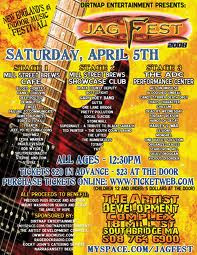 Okay this is a real mess. If I was the designer responsible for this poster I would quit my job immediately and deny ever being a designer. The background is hideous, the guitar looks absolutely awkward and out of place, the logo is plain ugly and the font is a disaster. All these would still be tolerable if not for the final nail on the coffin: the huge clump of words around the poster. I mean how could anyone bear to read this poster without getting a headache from all the badly placed paragraphs? Is every single word that important? 1/10. No question about it. If there is a perfect example of an ugly poster it would be this right here.

Now this is a nice poster. Its neat, but not awesome. I really love the background with lines, which fits with fashion event theme of the poster, as it represents the lighting effects at fashion shows. The words are kept simple, with the more important information in bigger fonts than the other boring details. It would be even better if it wasn't so plain, perhaps by adding more colors to it. 7/10
 This is a nice poster. Just words without any pictures or effects and it still manages to look presentable. The main points such as the name and date of the event are in big fonts so that a reader's attention is drawn to them first. The other minor details decrease in font size along with their importance and overall is a simple yet easy to read poster. 8/10
 I really like this poster. Firstly the designer used the colors really well to grab attention but at the same time doesn't make it too loud. I like how there is a progression from top to bottom, where we see the image, followed by the name and lastly all the minute details. Seeing the image first really generates interest in what this poster has to say, and the image is pretty creative too. Even the shape of the poster is unique, being curved at the edges gives it a really 'fun' feel to it. 10/10
 I am pretty sure this poster is done by a kid, and I don't mean that in a bad way. The whole event is about children so its only natural to have a design that kids can easily relate to, thus the simplicity of the poster. The slightly neon colors help gain interest, so do the picture of pandas. However the words could be arranged a little bit and if possible, reduced as kids most likely won't read all that. 7/10
Okay enough of posters, back to what I did in class. We formed into groups where we had to pick 3 ads or posters from magazines, and then re-draw it on a piece of paper. The aim of this exercise was to spot mistakes in posters and attempt to correct them. Unfortunately I kinda misplaced the drawings so I can't show you here but when I do find them I'll upload it!
Okay this lesson was pretty much about poster designs, like what makes a good poster design such that it effectively communicates the main idea of well, the poster.
Basically your poster can't be too messy such that it makes it difficult for the reader to digest. You can do this with the use of columns to neaten the words. I'll show you good and bad examples of posters below!


Now this is a nice poster. Its neat, but not awesome. I really love the background with lines, which fits with fashion event theme of the poster, as it represents the lighting effects at fashion shows. The words are kept simple, with the more important information in bigger fonts than the other boring details. It would be even better if it wasn't so plain, perhaps by adding more colors to it. 7/10


Okay enough of posters, back to what I did in class. We formed into groups where we had to pick 3 ads or posters from magazines, and then re-draw it on a piece of paper. The aim of this exercise was to spot mistakes in posters and attempt to correct them. Unfortunately I kinda misplaced the drawings so I can't show you here but when I do find them I'll upload it!
Friday, November 11, 2011
Sketches and lessons 2
Second design elective class whoohoo!
If I remember correctly the teacher was telling us something about cubism and the difference between art and illustration. I didn't quite understand how all this theory stuff was going to help in our projects or even future jobs and was pretty damn bored to be honest.


If I remember correctly the teacher was telling us something about cubism and the difference between art and illustration. I didn't quite understand how all this theory stuff was going to help in our projects or even future jobs and was pretty damn bored to be honest.

Scrolling aimlessly through my Facebook newsfeed while looking for something interesting to read proved futile so I went onto Youtube and there was a pretty hilarious spoof of magician David Blaine.
This led me to videos exposing David Blaine's (the real one) levitation trick.
(at 0.46 seconds you can see the shadow of his other foot on the ground)
And up next was Chris Angel's famous walking on water trick.
I may not be much of a cat but curiosity sure killed me that day.

My teacher caught me not paying attention in class and gave the typical "So what did I just say" question. As you've guessed, my answer was "uuuuuuhhhhhhhh". Well it was partly my fault for not being discreet about plugging in my earpiece so I kinda deserved it. I felt bad afterwords as it was really disrespectful so I went home and researched on cubism and all that stuff I missed out on.
Basically cubism is a form of art, which is mainly comprised of geometric shapes and is not supposed to look real, like the picture below.

There are also realism, surrealism and abstract art, just to name a few.
Here are some of my sketches I did at home. Forgive me for the shitty quality of the pictures, I had trouble scanning as I sketched in a rather thick book so it was pretty hard to hold the page down.
A chicken

A hip-hop chicken (yes i know the New Era and Nike logos are screwed up)

A random design

Another variation of the random design

A pair of shades

A rocket t-shirt

A muffin picture

Jared Leto's elbow tattoo (which I want to get)

A shoe

(which was supposed to look like this)

Another shoe

(which was supposed to look like this)

Yet another shoe

And the last shoe I sketched

Okay moral of the story: pay attention in class. And I really love shoes.
Sketches and lessons 1
First day of my design elective whoohoo! To be honest I wasn't really looking forward to it as I was good in neither design nor drawing (which are HYOOGE components in the elective) so I was kinda like a fish out of water.

Okay maybe like a pig in the air?

Err you get what I mean. Well within minutes the class was brought to a life-size replica of a fighter jet, with a random garden just beside it. Our first assignment was to sketch anything in that area. And I was like


Okay maybe like a pig in the air?

Err you get what I mean. Well within minutes the class was brought to a life-size replica of a fighter jet, with a random garden just beside it. Our first assignment was to sketch anything in that area. And I was like

The only things I could draw without having to look like random doodles were stickmen, and even then it was still pretty bad. But anyways I decided to give it a try since we weren't going to be graded on our ability to sketch. Every few minutes I sneaked a glance at my classmate's paper and it was then that I realised I wasn't the only poor soul with terrible drawing skills. One guy was struggling to draw the outline of a leaf, for a moment I thought he was doing a self-portrait. But who am I to judge?
So after a very long time and 13 ant bites (4 on the left foot and 9 on the right) I finally picked a cactus and started to sketch it. Here's the end result

Not that bad isn't it? I was pretty impressed with my work so I decided to ask 2 of my female friends for their opinions on the way back to class.
"Eeeeeeeewwwwww!!!"
"That's damn gross!!!"
But it turns out both of them really disliked cactuses, which explained their adverse reactions. So if both of them managed to tell that I was sketching a cactus, it means my drawing isn't that bad after all!
Our next exercise back in class was pretty simple: to draw anything. For some reason I've had this mental image of a muffin-loving zombie in my head for the past few days (don't ask why) and that was exactly what I drew.

This is the original sketch and I felt that this picture was kind of naked without colours, unlike the cactus one, and so I went home and applied some colours to it using photoshop.

Dayuuuummmmmm son! I must say I was really pleased with my work, shocked in a way too. It isn't going to be featured in art galleries anytime soon but considering my artistic 'talents' in the past, I have to admit that its not bad. And like they always say, practice makes perfect!

Subscribe to:
Posts (Atom)